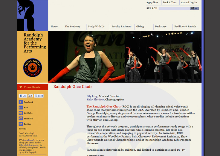
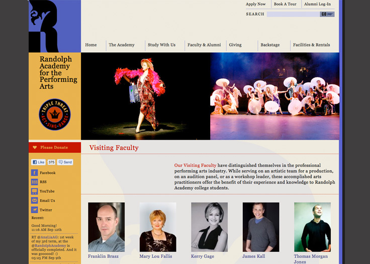
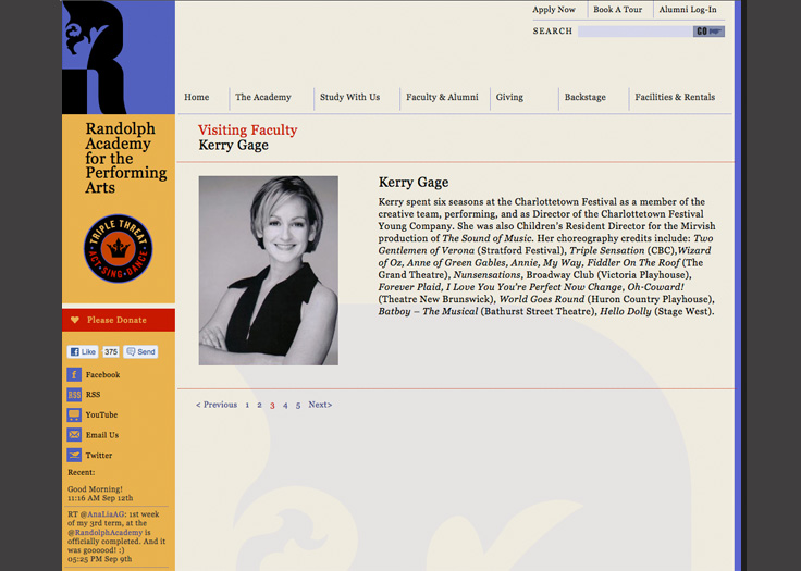
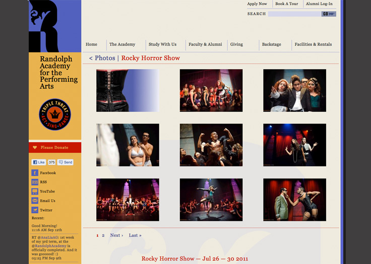
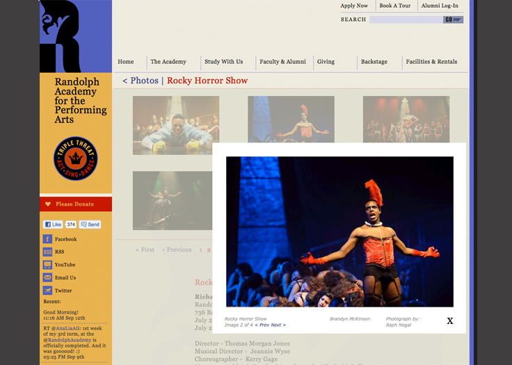
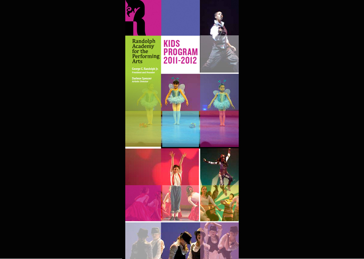
Toronto's Randolph Academy for the Performing Arts was in need of a brand makeover and website redesign. We began with the academy's “Triple Threat” positioning, which provided the inspiration for the central element in the new identity program: the motif of the crown. Visually we saw lots of playful, theatrical and celebratory opportunities inherent in the use of the crown graphic, starting with the fact that its three peaks symbolize the three primary disciplines – Acting, Singing, and Dancing – that together form Randolph’s Triple Threat foundation.
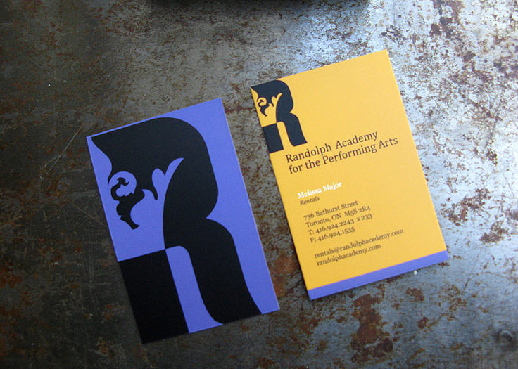
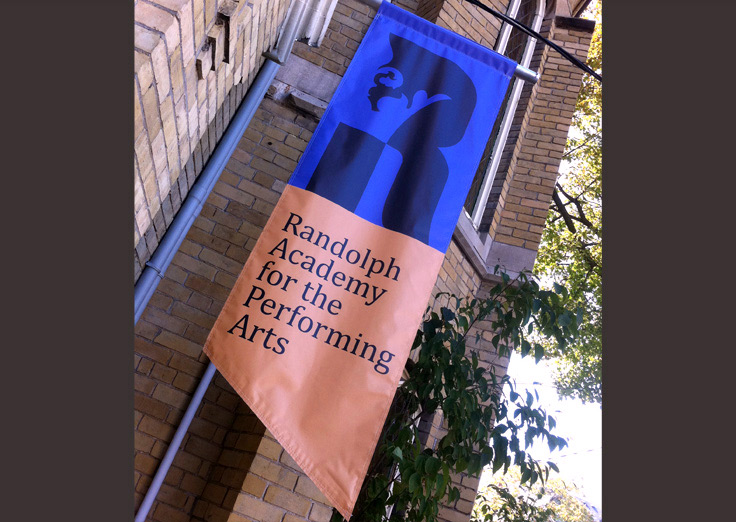
The identity program grew organically from there – it was serendipitous to discover that the “R” for Randolph also happened to be the perfect form to integrate the partial crown into its centre. Graphically, we love how it at once embodies many historical references of the performing arts, from Shakespearian drama to modern theatrical pageantry. We also found that it comfortably supports both the seriousness of the college’s education ideals as well as the free-spirited fun of the children’s program.
Symbolically, It was not lost on us that what Randolph graduates can always depend on is the quality and breadth of the education they’ve received from George and his staff at the Academy. They are, in effect, prepared and groomed to be kings and queens of their industry, well-equipped to rise to whatever opportunities and challenges their careers present them.

